Article , Blog #01
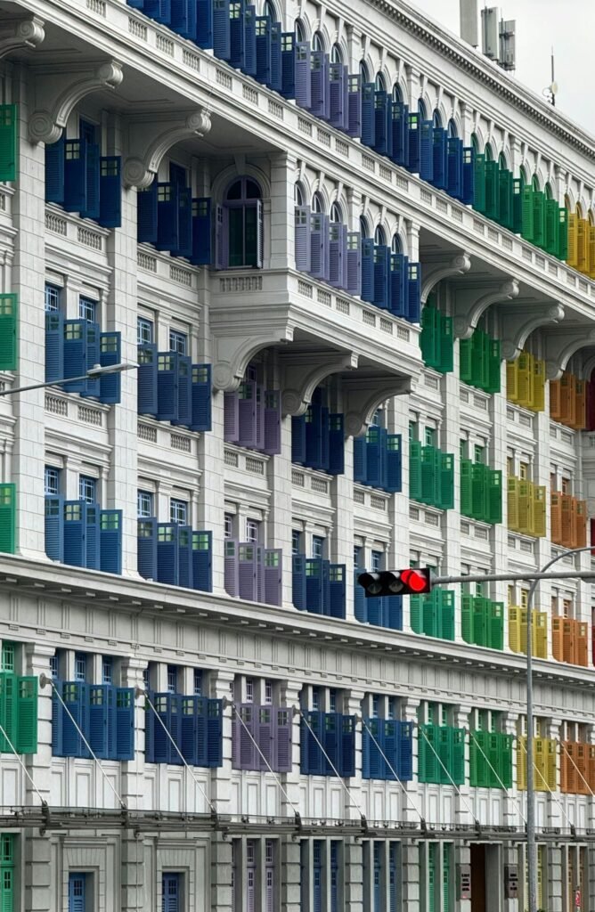
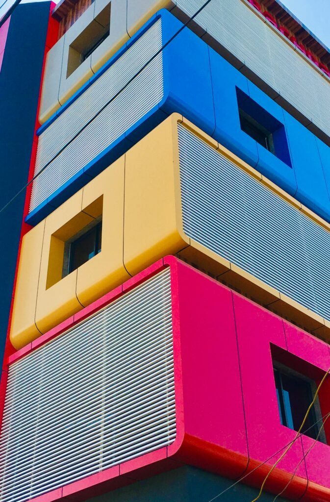
The Color Psychology in Architecture
How color affect your mood
If you walk into a hospital emergency room, you will find no walls of bright yellow or loud red. But if you walk into Google headquarters, you will find bold splashes of orange, dramatic splashes of blue, and colors that appear to hum with energy. The jarring contrast is no accident—it is a result of scientific principles.
Research conducted over decades has shown that color can produce physiological effects in the body, including changes in heart rate and changes in levels of stress hormones. Nevertheless, color is still regarded by many architects as not more than a superficial ornament. Given that humans spend over 90% of their lives indoors, this is an attitude that ignores an elemental consideration for defining human experience.
The colors around us serve a purpose beyond beauty. They affect how we feel, recover, and function. The difference between what is understood in color psychology in design and what is actually applied in real buildings is astonishing.
Does using color in buildings actually have an effect on your mood?
Your brain doesn’t merely perceive color; it interprets it along intricate pathways that produce actual physiological reactions.
Stand in a red room for a few minutes, and you’ll notice an increase in your heart rate, a change in your blood pressure, and an increase in your cortisol levels.
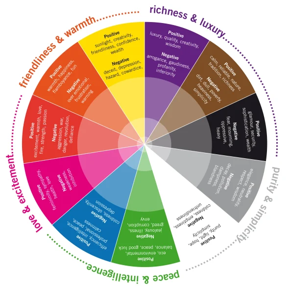
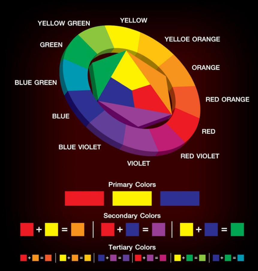
Consider it this way: the hot colors of red, orange, and yellow are a shot of espresso for your nervous system. They alert you, stimulate you, and make you intense. The cool colors—blue, green, and purple—are more like a relaxing bath. They slow you down, make you focus, and encourage more profound contemplation.
The Science Behind Psychological Effect of Color
The procedure adds up when you put it step by step. The red wavelengths excite the sympathetic nervous system—useful for being wide awake in a crisis, but not useful when the objective is recovery from surgery. Blue wavelengths do just the reverse, exciting the parasympathetic system to induce relaxation. Green, being in the center of the spectrum, is the most relaxing color on the human eye. Since our eyes need less effort to process green light, it has a natural effect of creating calmness and restfulness.
Evidence that is found in the reality of building Color Effect
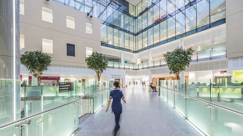
Cincinnati Children’s Hospital transformed its patient environment by eliminating unfriendly fluorescent lighting and forgettable beige walls for a dynamic color scheme that changes with the time of day, mimicking natural sunlight. The results were staggering: 70% reduction in patient anxiety, and recovery times averaged a day and a half shorter. This enhancement not only enhances the well-being of patients but also cuts costs significantly. It emphasizes the importance of context in using the color psychology principles in designing buildings.

Typology of Colors in Architecture
Different buildings need completely different color strategies, and most architects are getting it wrong. The key is understanding what each space needs to accomplish and matching the color psychology to those goals.
Healthcare: No more Beige
The health care sector has applied color theory to a great extent in designing hospitals, mainly because it was possible to track patient recovery and increased awareness among hospitals for risk. According to research by the University of Texas Health Science Center, warm, earthy colored rooms resulted in patients requiring 25% less pain medication compared to patients accommodated in common white rooms.
But color utilization is not a panacea. In emergency rooms, colors are used to maintain workers’ stimulation and reaction to intense-stress situations, while in recovery wards, there are soothing color tints designed to facilitate sleeping and convalescence.
Design for Different Medical Environment
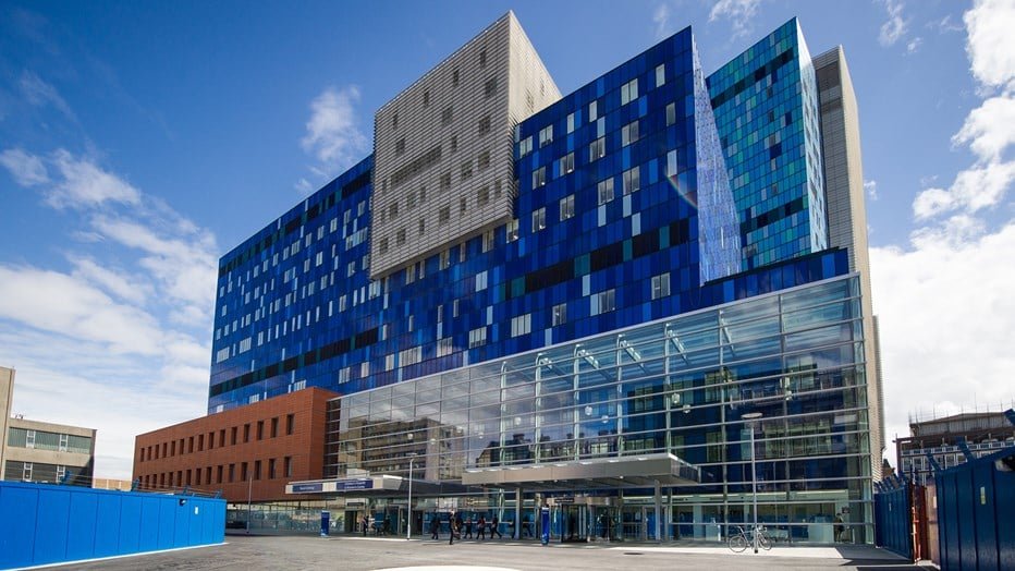
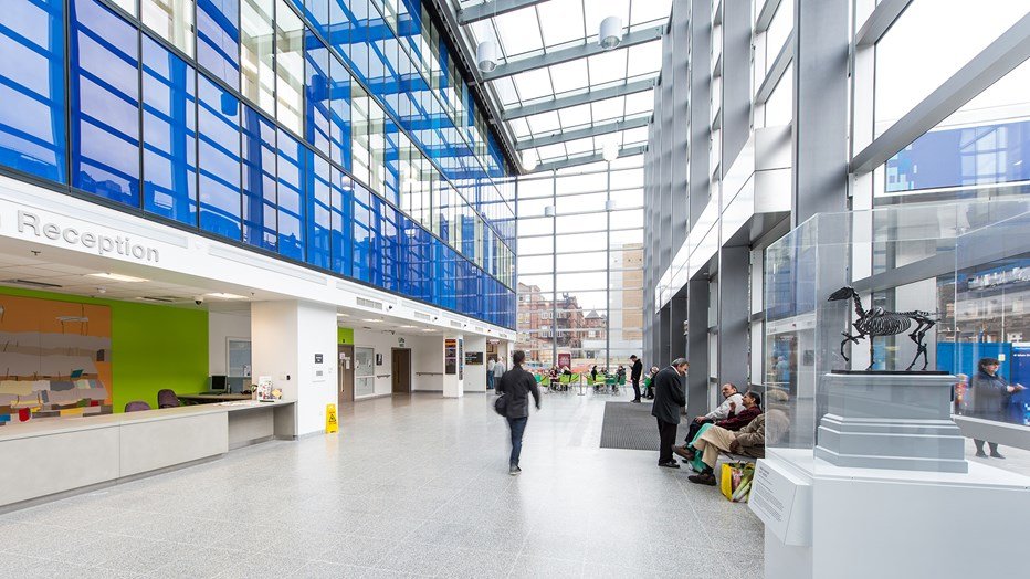
The Royal London Hospital employed computer simulation to create the ideal wavelength distribution among wards, modifying the colors to fit the particular functions of each department. Emergency departments utilized red and orange trim to be on high alert to personnel, while pre-surgery departments utilized calming blues and greens. Patient rooms combined the warm earthy shades with cool trims to help create a harmonious balance. This strategic application of color is how evidence-based healthcare design will be applied to enhance patient recovery and worker productivity.
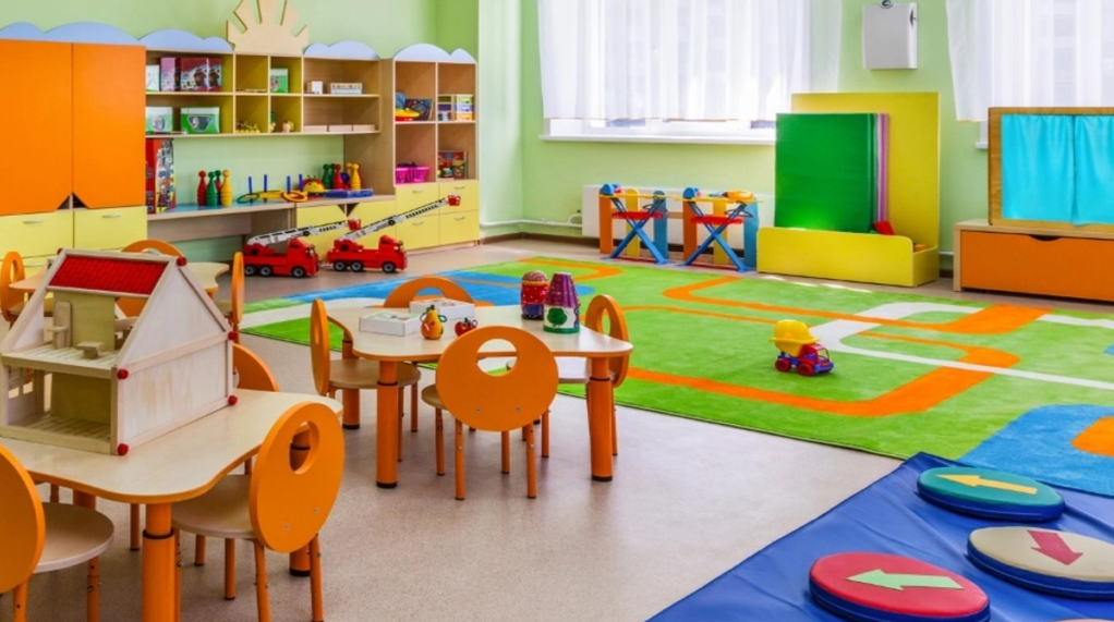
School: A learning, COLOR
It is disheartening to observe that, in spite of all the data to the contrary, many schools still operate like institutional prisons. A University of British Columbia study finds red environments enhance attention and focus on details for precise tasks, and blue environments enhance creativity and effective problem-solving.
These principles were applied at the California-based Nueva School: red-dominant color schemes were used to create math and science classrooms to promote focus, and blue-green colors were used in art and humanities classrooms to encourage creative thinking. The results showed—15% gains in test scores in the first year, with creative problem-solving with the largest gains.
Creating Learning-specific Color Environment
Every subject thrives using its own color strategy.
Science and math laboratories are best optimized by bluer and greener colors that promote concentration and stimulate rationality. But art and writing rooms are enhanced by warm colors that stimulate creativity and innovation.
Libraries require a master plan: study space may welcome soothing blues and greens, but team space may welcome energizing yellows and oranges to spur energy and collaboration. The overall rule is to find balance in the color psychology with the nature of the learning process.
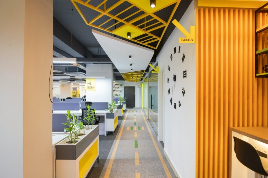
Workplace: The Productivity Accelerator
Corporate environments hold possibly the most untapped potential in the design of buildings. Companies invest millions in wellness programs and productivity coaches, but workers toil in utilitarian beige offices—surroundings that research demonstrates drag down performance.
One study, following 1,500 white-collar workers in 12 offices, discovered that carefully selected colour schemes improved job satisfaction by 23% and improved intellectual performance by 18%. The moral: different types of work need different colours.
Color Strategies & Functions
Activities that require analysis thrive under blue, darker shades of color in cooler hues. Accounting suites, law firms, and laboratories benefit from using blues and greens that foster concentration and precision.
Cooperative activities, on the other hand, thrive in warmer, energizing environments. Marketing groups, creative groups, and meeting rooms function best with oranges, yellows, and warm reds that promote engagement, idea sharing, and active brainstorming.
Color Challenge and Office space that is lofty & open
Open-office setups raise special problems for the application of color psychology, as diverse working styles need to share one space. Zoning, colorfully separating space for heavy, solo work from spaces of collaboration and communication, is an effective solution.
Others take this idea further with dynamic LED lighting systems whose color changes throughout the day. Mornings may consist of invigorating colors to keep people awake, while afternoons may consist of calming, soothing colors that help reduce stress and facilitate productivity.
Architects and the necessity of using color in design
The numbers don’t lie. Buildings designed without color psychology consideration average 12% lower employee satisfaction and 8% higher turnover. Healthcare facilities that ignore this research see longer patient stays and higher medication costs. Schools with poor color design show measurably worse student outcomes.
We’re talking billions in lost productivity across the built environment. But here’s the problem: most architecture schools don’t require coursework in environmental psychology or neuroscience. The profession prioritizes form over human factors, and it’s costing us.
Color Psychology in Business cases
When hospitals reduce patient stays by 1.5 days on average through better color design, that’s massive cost savings. When schools see 15% improvement in test scores, that’s better educational outcomes. When offices report 23% higher job satisfaction, that’s reduced turnover costs. The return on investment for thoughtful color design is clear. The upfront cost of color consultation and specialized lighting systems pays for itself through improved building performance.
Training the Next Generation of Architects
Architecture education needs to change. Students should learn about environmental color psychology alongside structural engineering and building codes. The human factors of design are just as important as the technical aspects. Progressive architecture firms are already hiring color psychologists as consultants. The competitive advantage goes to architects who understand how their buildings affect the people inside them.
How Does Color Actually Affect Your Brain
Recent fMRI studies show exactly what’s happening in your brain when you’re exposed to different colors. Red wavelengths light up your amygdala—the part that handles alertness and anxiety. Blue wavelengths activate your prefrontal cortex, improving focus and analytical thinking while reducing stress hormones.
The Neurological Pathway of Color Processing
our brain processes color through multiple pathways simultaneously. The visual cortex handles basic color recognition, but the limbic system—your emotional center—also responds directly to wavelengths. This is why color affects mood so quickly and powerfully. The timing matters too. Brief exposure to energizing colors can boost performance, but extended exposure often backfires. This is why we need dynamic color systems that adjust based on how spaces are used.
Individual Differences in Color Response
Not everyone responds to color the same way. Age, gender, and personal history all influence how you react to different colors. Children tend to prefer brighter, more saturated colors, while adults often favor muted tones. Some people are naturally more sensitive to color than others. Architects need to design for the average response while accommodating individual differences through flexible lighting and color-changing systems.
Does Culture Change How We See Colors?
While certain physiological responses seem universal—red consistently increases arousal across cultures—the psychological associations vary dramatically. This creates challenges for architectural color trends in multicultural environments. White means purity and cleanliness in Western cultures, which is why hospitals use it everywhere. But in many Asian cultures, white signifies death and mourning. Blue is calming in North America but can represent sadness in other contexts.
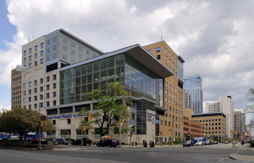
Designing for Multicultural
Toronto General Hospital handled this beautifully during their renovation. They consulted extensively with their multicultural patient population and ended up emphasizing universal principles—natural light and biophilic color palettes—while avoiding culturally specific associations that might create discomfort. The solution often involves focusing on colors that have positive associations across cultures. Earth tones, natural greens, and sky blues tend to be universally calming and pleasant.
Global Color Psychology research
Color response is seen similar in different researches in various countries in the world. The physiological effects tend to be consistent—red increases heart rate regardless of culture—but the emotional associations vary widely. Architects working internationally need to understand these cultural differences. What works in a New York office might not work in a Tokyo hospital or a Mumbai school.
Does color affect your sleep and health?
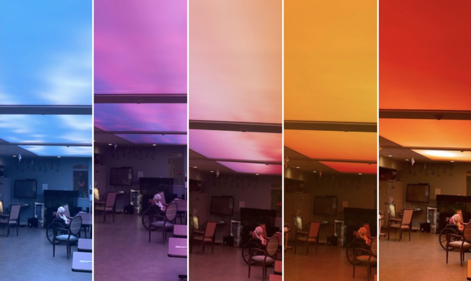
Circadian Lighting System
The color temperature of your lighting and even the spectral characteristics of painted surfaces directly influence melatonin production, sleep quality, and metabolic function. This is where circadian color lighting architecture becomes crucial. Traditional fluorescent lighting, with its blue-heavy spectrum, disrupts circadian rhythms when used inappropriately. This contributes to what researchers call “sick building syndrome”—widespread sleep disorders among office workers.
Progressive practices now integrate circadian lighting systems that adjust color temperature throughout the day, supporting natural biological rhythms. Morning light has more blue wavelengths to promote alertness, while evening light shifts to warmer tones that encourage melatonin production. But it goes beyond artificial lighting. South-facing spaces with warm-colored walls can become uncomfortably stimulating during peak daylight hours, while north-facing rooms with cool palettes may feel depressingly dim.
The Health Impact of Poor Color Design
Spaces with inappropriate color schemes can contribute to fatigue, headaches, and mood disorders. The wrong colors at the wrong times can disrupt sleep patterns even hours after exposure. Healthcare facilities are particularly sensitive to these effects. Patients recovering from surgery need environments that support healing, not colors that increase stress hormones.
Your Home & Color
One might not know that the color that you use in your home does impact your mental health a lot! One may use a color that he/she likes but it is very important to use proper color and lighting in each room to enhance one’s productivity or no color at all!
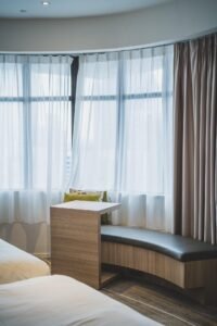
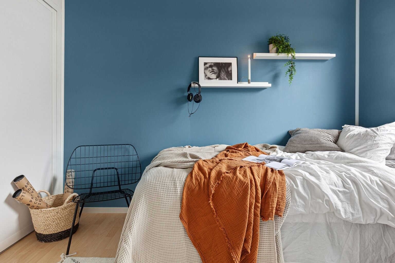
BEDROOM:
The University of Rochester found that bedroom color affects sleep quality. Blue environments promote deeper, more restorative sleep compared to other colors. Avoid red and bright orange in bedrooms—they’re too stimulating for rest. Warm earth tones work well for bedrooms too. Browns, soft greens, and muted yellows create a cocoon-like feeling that promotes relaxation. The key is avoiding colors that are too bright or too dark.
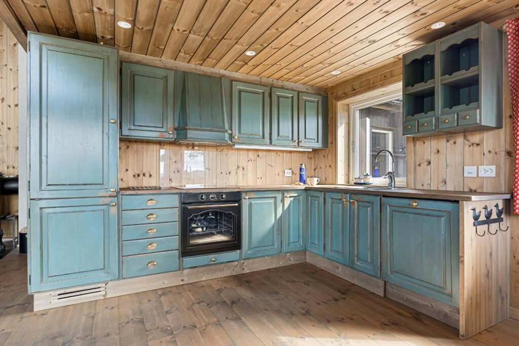
KITCHEN:
Kitchen color affects appetite and social interaction. Warm yellows and oranges encourage gathering and conversation, while cool blues can suppress appetite. This is why most restaurants use warm color schemes. Red can work in kitchens but use it sparingly. Too much red can make people feel rushed and stressed while eating. A better approach is using red as an accent color with neutral backgrounds.
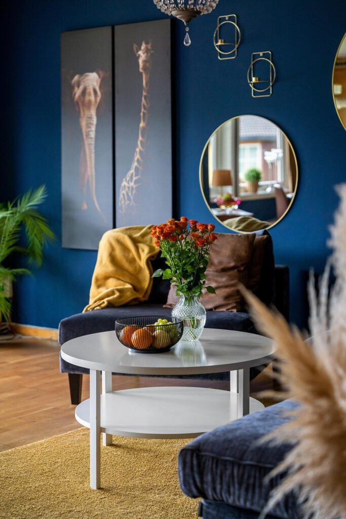
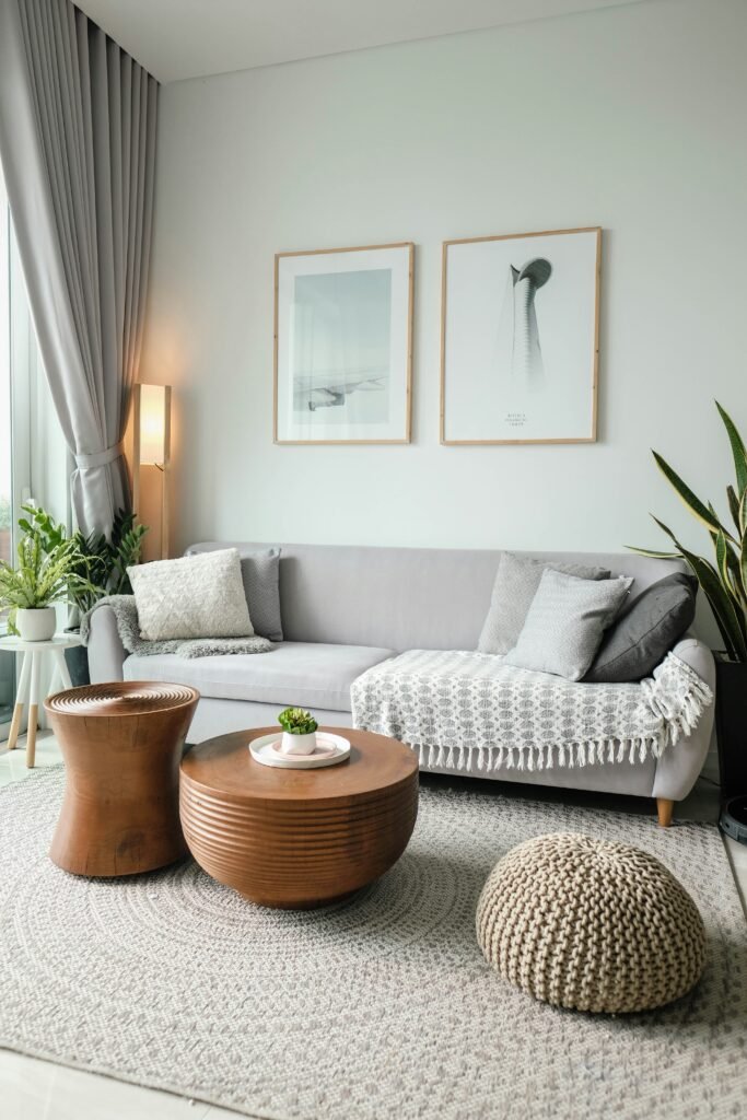
LIVING SPACE
Living rooms need to balance energy and relaxation. You want people to feel comfortable and social, but not overstimulated. Warm neutrals with colorful accents often work best. The challenge is balancing psychological optimization with personal preference and cultural considerations. Smart residential designers now use color consultation as a standard service, employing validated assessment tools to determine optimal strategies for individual families.
How do Store Use Color Psychology
Retail and hospitality have embraced this research with enthusiasm, mainly because the results show up directly on the bottom line. But it’s more sophisticated than the old “red creates urgency” approach.
Modern Retail Color Strategies:
Contemporary retail color strategy considers the entire customer journey. Nordstrom’s flagship store used computational color modeling to optimize lighting and surface colors for garment display, resulting in a 22% increase in sales per square foot. Different retail environments need different approaches. Luxury stores often use calming colors to encourage browsing and consideration. Discount retailers might use more energizing colors to create urgency.
Hospitality Color Design:
Luxury hotels now employ color psychologists as standard consultants, recognizing that optimal color design can justify premium pricing while reducing operational costs through improved energy efficiency. Hotel lobbies need to feel welcoming but not overstimulating. Guest rooms should promote rest and relaxation. Restaurants within hotels might use different color schemes to encourage dining and social interaction.
The Future of Color Psychology in Architecture:
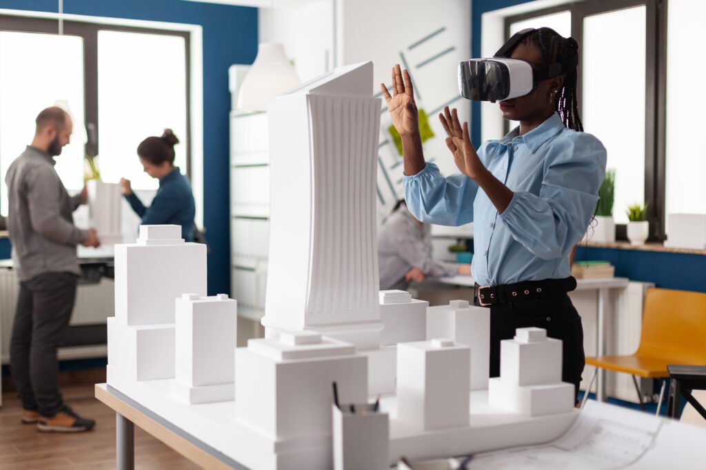
Virtual and augmented reality systems now let architects test color strategies with real human responses before construction begins. Machine learning algorithms analyzing biometric data from building occupants will soon enable real-time color optimization—spaces that adjust based on collective physiological and emotional states. The integration of color psychology into building information modeling systems will make evidence-based color design routine rather than exceptional. As green building certification programs begin incorporating human factors metrics, architects who master these principles will have competitive advantages.
Key Takeaways: Color psychology in architecture isn’t just about aesthetics—it’s about human health, performance, and wellbeing. The research is clear, the tools are available, and the benefits are measurable. It’s time for architects to embrace evidence-based color design.